Aljunied Town Council

| Designer |
|
||||||||||
|---|---|---|---|---|---|---|---|---|---|---|---|
| Client |
Aljunied Town Council |
||||||||||
| Year |
1989 |
||||||||||

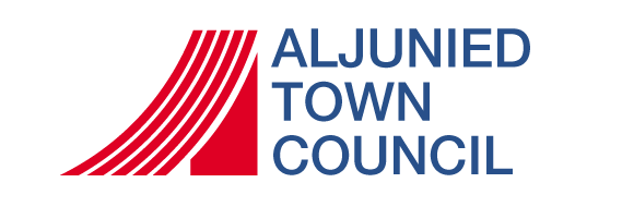
This modern, graphic treatment of the letter 'A' is supported by what looks like the number '1', suggesting a superior or 'A1' logo. It also resembles four bars supported by a solid column, which symbolises how the town council is a responsible for its resident but is also its backbone. The four bars not only suggest the number of constituencies under the Town Council's care but the four official races in Singapore.
The colours of the logo have also been loaded with meaning. The white spaces between the bars suggest the Town Council's sincerity and purity of intention while the red symbolises fraternity.
In 2011, the town council merged with Hougang Town Council to form Aljunied-Hougang Town Council.
| References |
|
||||||||||
|---|---|---|---|---|---|---|---|---|---|---|---|